LAS FALLAS
This branding campaign celebrates Las Fallas, the annual Spanish festival of renewal, by translating its rich traditions into a cohesive visual identity rooted in research and storytelling. The goal was to create an inviting, contemporary campaign that captured the festival's vibrant energy while honoring its cultural significance.
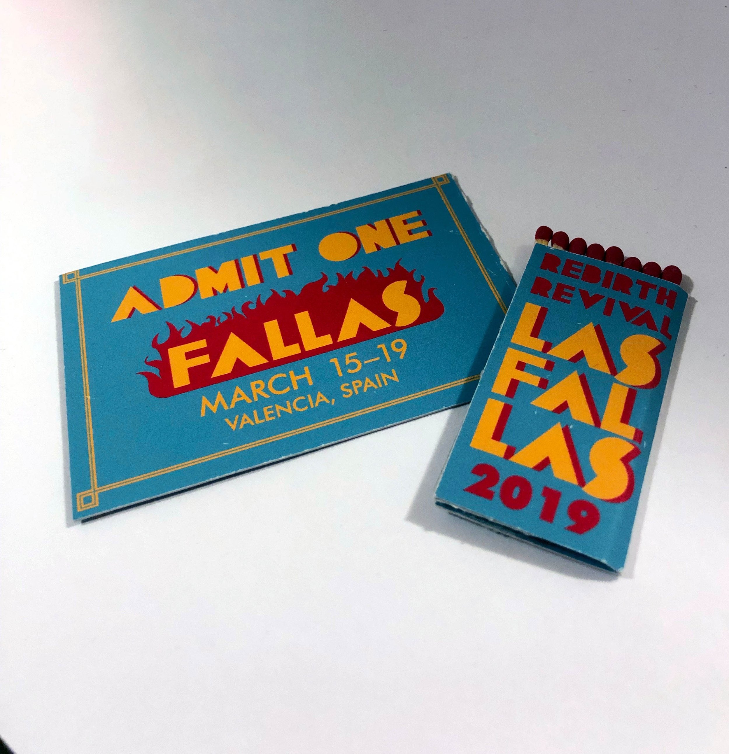

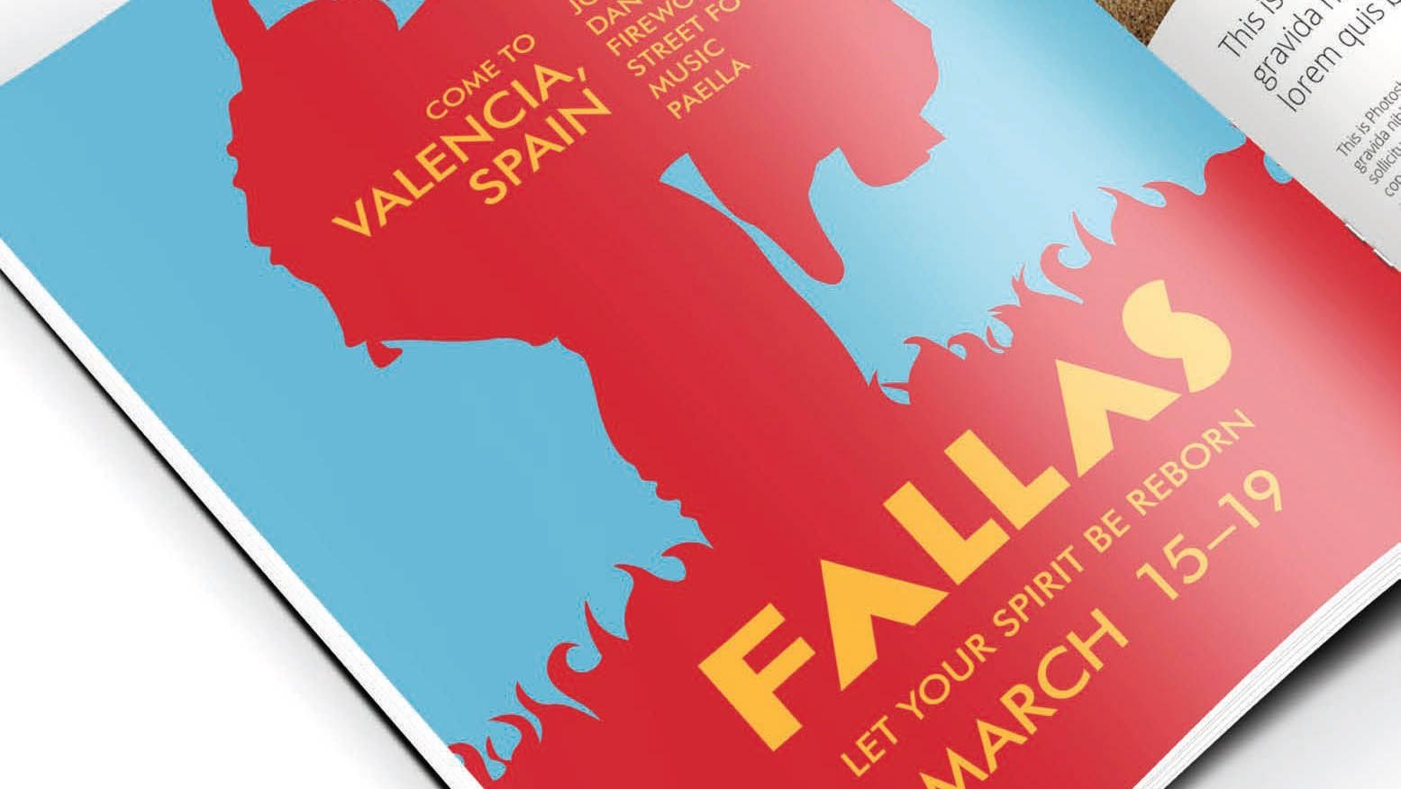
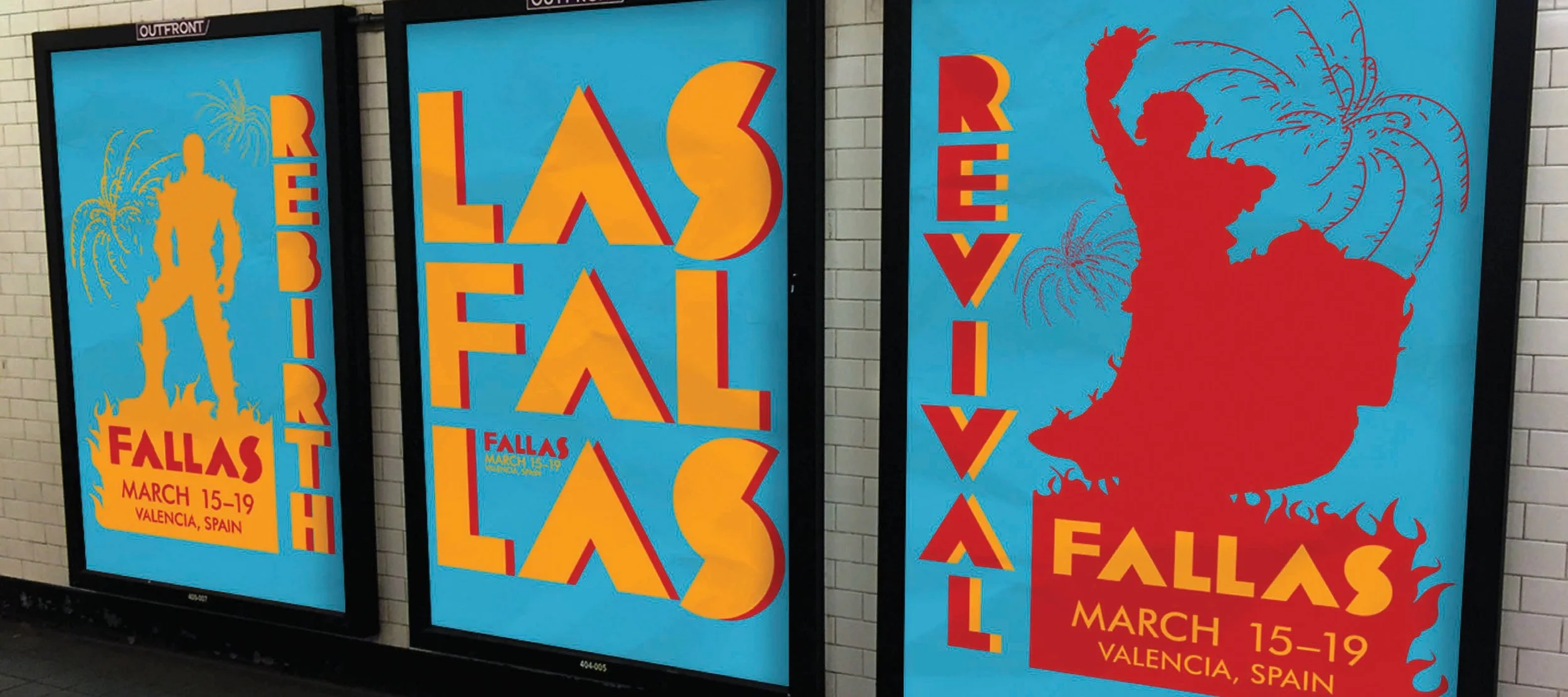
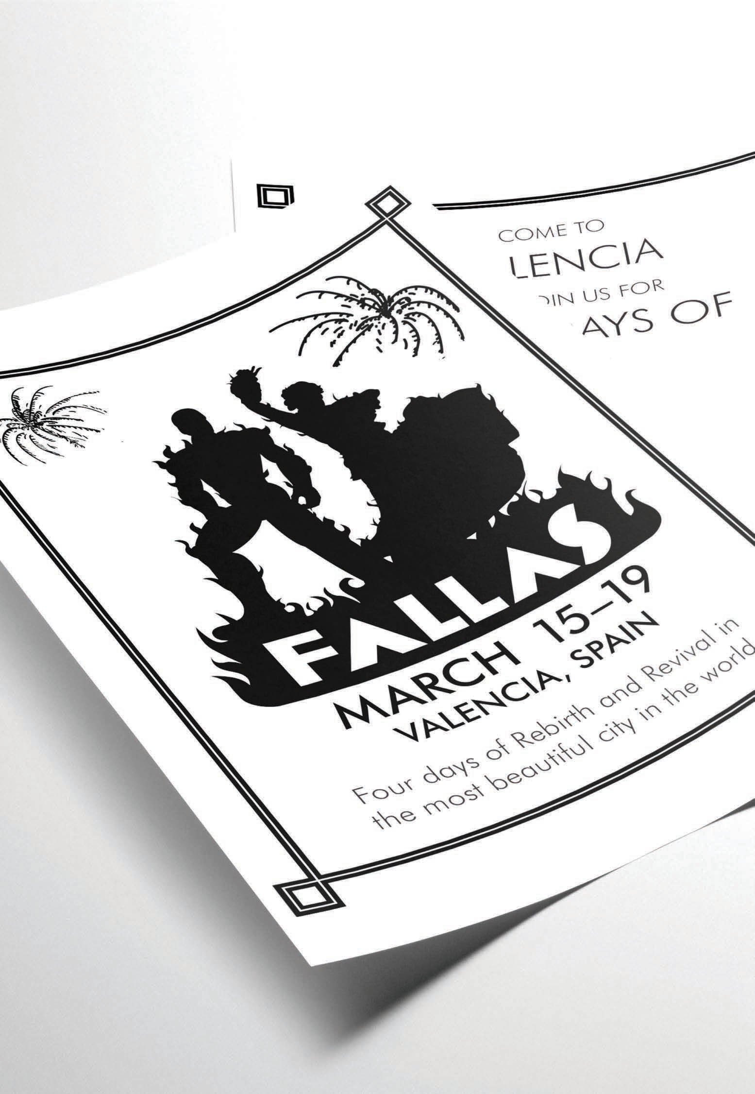
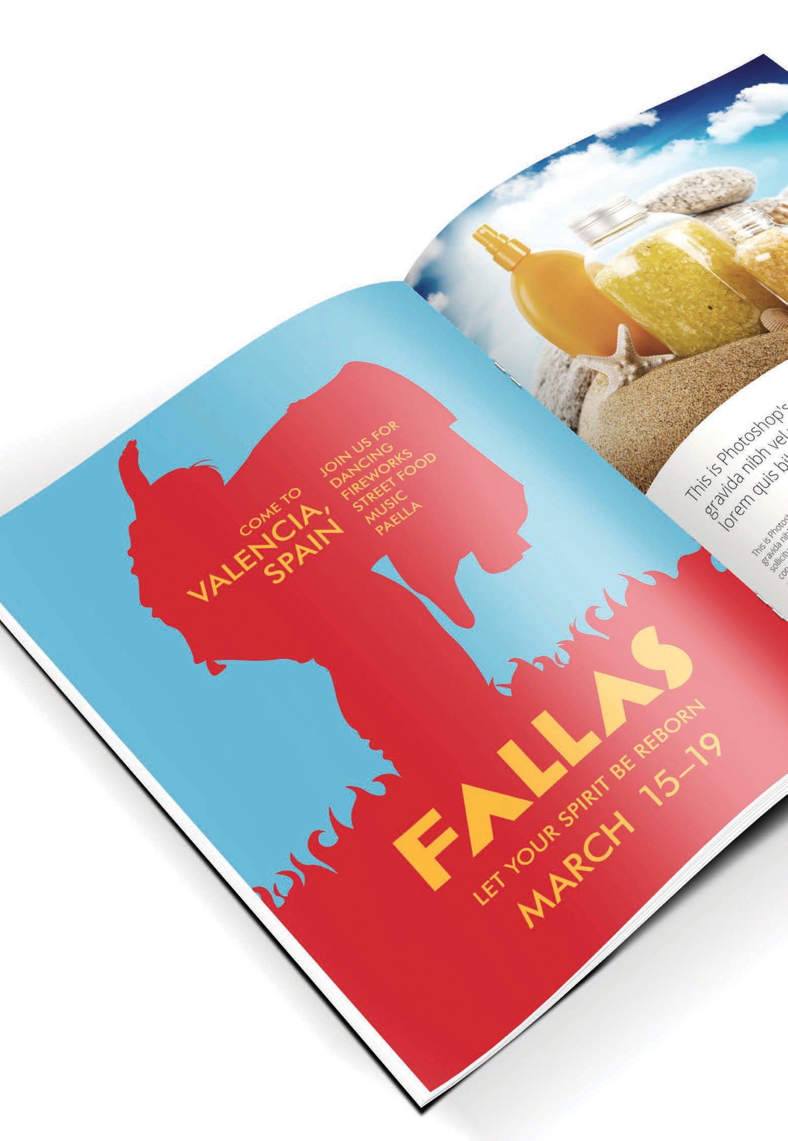
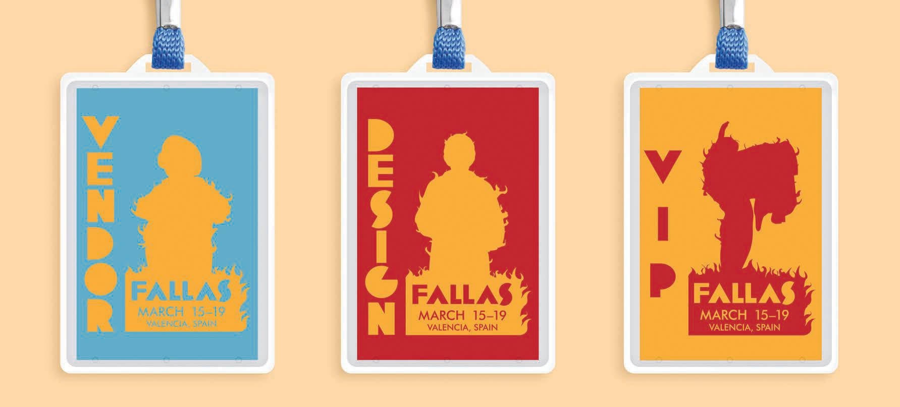
A palette of softened primary colors established a warm, welcoming tone, while illustrations inspired by traditional Valencian dress, folk dancing, fireworks, and festival iconography reflected the customs that define Las Fallas. A custom display typeface, influenced by vintage Spanish travel posters, was designed to stack vertically, creating bold compositions reminiscent of festival banners and street signage. Throughout the campaign, fire served as a recurring visual motif, symbolizing the festival's origins as a celebration of rebirth through the ceremonial burning of winter's remnants.
This narrative culminated in the ticket design, where attendees receive a branded matchbook that doubles as their admission stub—a playful nod to the festival's iconic finale, when towering fallas monuments—intricately crafted sculptures made from wood, cardboard, and other combustible materials—are ceremonially burned as a symbolic act of renewal.